
Marketing Data Visualization: Map 8 Charts to Their Exact Question
For marketers: match 8 chart types to the exact marketing question each answers, follow a repeatable build checklist, and choose tools without overbuying.

Marketing Data Visualization: Map 8 Charts to Their Exact Question
Marketing data visualization is the practice of turning campaign, funnel, and revenue data into charts and dashboards that reveal patterns faster than a spreadsheet ever could. Its value is simple: teams that see performance clearly make faster, better-argued decisions in budget meetings. This guide breaks down the chart types, the build process, the design rules, and the tool criteria that separate a dashboard people trust from one they ignore.
TL;DR:
- Visualizations should answer precise questions, such as channel performance or funnel drop-off, rather than trying to cover multiple metrics in one view.
- The right chart type depends on the question: line charts for trends over time, bar charts for comparisons, and funnel charts for stage-by-stage analysis.
- Building dashboards around specific questions and validating data before polishing design reduces errors and improves trust.
- Using automated tools like Paid Lens can save time by automatically validating data and providing ranked recommendations instead of manual interpretation.
- Clear context, consistent definitions, and annotations are essential to prevent misleading insights and ensure dashboards support faster decision-making.
Table of Contents
- What Marketing Data Visualization Actually Covers
- Where Better Visuals Actually Move the Needle
- Chart Types and the Exact Question Each One Answers
- The Build Process: From Question to Working Dashboard
- Design Rules That Keep Dashboards From Lying to People
- Common Mistakes That Quietly Undermine Trust
- Choosing the Right Tool Without Overbuying
- How Paid Lens Fits Into a Team’s Visualization Workflow
- Turning Charts Into a Story Someone Actually Remembers
- Measuring Whether Your Dashboards Are Actually Working
- Automate the Recommendation, or Keep Building Dashboards by Hand?
- A Faster Path From Dashboard to Decision
- Sources
- FAQ
What Marketing Data Visualization Actually Covers
Marketing data visualization spans everything from a single KPI card on a Slack digest to an interactive dashboard a CMO opens every Monday. The format matters less than the job it’s doing: some visuals exist for operational monitoring (is spend pacing correctly today?), while others exist for storytelling (why did Q3 revenue jump, and what should we do next quarter?). Confusing the two is one of the most common design mistakes marketers make.
An effective data storytelling approach starts by identifying which of these two modes a visual serves, because that choice determines the chart type, the refresh rate, and even who should see it.
Three questions marketers ask almost daily, and the visuals built to answer them:
- Which channel is driving the most qualified leads this week? (bar chart, ranked)
- Where in the funnel are we losing the most volume? (funnel chart)
- Is this campaign’s cost-per-acquisition trending up or down over time? (line chart)
Each of those visuals answers one specific question. A dashboard that tries to answer ten questions in one view usually answers none of them well.
Where Better Visuals Actually Move the Needle
The real payoff of good visualization is speed. A team that can see channel performance in one glance during a Tuesday standup skips the twenty-minute detour into raw spreadsheet exports, and that time compounds across every meeting on the calendar.
Concrete use cases where visualization changes outcomes:
- Campaign optimization: spotting an underperforming ad set before it burns another week of budget
- Weekly monitoring: a shared dashboard that replaces a manual Monday report
- Executive updates: a single summary view that survives a five-minute board conversation
- Funnel troubleshooting: isolating exactly which stage is bleeding conversions
Statistic Callout: Accessible, story-driven dashboards reduce cognitive load and improve how quickly stakeholders grasp what’s happening, according to best-practice guidance synthesized across industry marketing reporting guides. The practical effect: less time spent re-explaining a chart, more time spent deciding what to do about it.
That last point is the one marketers underestimate most. A dashboard’s real return isn’t the hours saved building it. It’s the hours saved arguing about it in the room where budget actually gets reallocated.
Chart Types and the Exact Question Each One Answers
Picking the right chart type isn’t a design preference. It’s a matching exercise between the shape of your data and the question you’re asking. Here’s a working reference for a marketing analytics dashboard:
- Line charts show a trend over time. Use them for CPA, ROAS, or spend trending across weeks. Example widget: a 90-day ROAS line with a target threshold overlaid.
- Bar charts compare discrete categories. Use them for channel-by-channel spend or conversions. Example widget: paid search vs. paid social vs. email, ranked by conversions this month.
- Area charts show cumulative volume or composition over time. Use them for stacked spend by channel across a quarter, where the total matters as much as the parts.
- Funnel charts show stage-by-stage drop-off. Use them for the awareness-to-purchase journey, or a lead-to-opportunity-to-close pipeline.
- Geo maps show performance by region. Use them when budget allocation decisions depend on where demand actually lives, particularly relevant when demographic and regional trend data shapes where you target next.
- Heatmaps show intensity across two dimensions. Use them for day-of-week and hour-of-day performance, or for click density on a landing page.
- KPI cards show a single number, usually with a trend arrow. Use them for the four or five metrics that matter most on an executive summary, where detail would only distract.
- Tables show precise values when exact figures matter more than shape. Use them for a channel breakdown someone needs to export into a spreadsheet afterward.
A few notes on interactivity that don’t get discussed enough:
- Static charts work fine for a weekly PDF or a slide deck where nobody needs to drill in.
- Interactive charts earn their complexity when the audience will actually filter, hover, or drill down. Building a filterable dashboard for an executive who only ever looks at the top-line number is wasted engineering effort.
- Libraries like D3.js give you full control over custom layouts and interaction, which matters when you need a visual that no off-the-shelf chart type covers. For standard chart types embedded quickly into a report or app, something like Chart.js gets you there with far less setup.
The line between “nice interactive toy” and “genuinely useful drill-down” comes down to one test: will someone actually click into it more than once?
The Build Process: From Question to Working Dashboard
Every dashboard that earns trust starts the same way: with a specific question, not a vague ambition to “see all our data in one place.” Here’s the repeatable sequence:
- Define the goal and the audience. Write down the exact question the dashboard answers and who’s going to look at it. A dashboard for a CMO and a dashboard for a paid social specialist should almost never be the same view.
- Collect and validate the data. Pull from ad platforms, GA4, and CRM sources, then check for the usual culprits: mismatched date ranges, duplicate conversions, currency inconsistencies across accounts, and attribution windows that don’t match across platforms.
- Choose the metrics that answer the question. Resist the urge to add every metric available. If the question is “is this campaign profitable,” you need CPA, ROAS, and revenue, not fifteen supporting metrics nobody asked for.
- Pick the visual for each metric, using the chart-type logic above.
- Build a first draft and test it against the original question before showing anyone else.
- Review with stakeholders and iterate. The first version is rarely the final one, and that’s fine.
Quick validation checklist before you trust any number on a dashboard: confirm the data source’s last refresh timestamp, cross-check one metric against the platform’s native report, and verify that attribution windows match across every channel being compared.
Pro Tip: Build the ugliest possible version first, using default chart formatting and no color, and get one stakeholder to confirm the numbers are right before you spend a single minute on design polish. Fixing a data error after the dashboard looks beautiful costs three times as much time.
If your data sits scattered across a dozen platforms before any of this can start, a structured plan for consolidating those sources is worth building before you touch a chart library.
Design Rules That Keep Dashboards From Lying to People
A visualization doesn’t need to be technically wrong to mislead someone. It just needs to be missing context. The fixes here are less about aesthetics and more about discipline.
Keep it focused. Every chart should answer the one question it was built for. If you catch yourself adding a second Y axis to squeeze in “one more metric,” that’s usually a sign you need a second chart, not a more complicated one.
Always show context. A single number without a comparison point is close to meaningless. Every chart should carry:
- The time window it covers
- A comparison point (previous period, target, or benchmark)
- Any known anomaly that could explain a spike or dip (a holiday, an outage, a pricing change)
Use color with intent, not decoration. Reserve red and green exclusively for “bad” and “good,” and never use them for anything else on the same dashboard, or you’ll train viewers to misread neutral data as a warning. Check that your palette holds up for colorblind viewers. Pair color with a shape or label as a backup signal.
Annotate the moments that matter. A spike in traffic means nothing to someone seeing the chart cold. A one-line annotation (“Black Friday promo launched”) turns a confusing blip into an obvious explanation.
Pro Tip: Before publishing any dashboard, ask someone outside the team to describe what they see in ten seconds. If they can’t state the main takeaway without asking you a question, the chart still has work to do.
Common Mistakes That Quietly Undermine Trust
Bad visualizations rarely look bad. They look confident, which is exactly what makes them dangerous when the underlying logic is off.
A dual-axis chart comparing two metrics with wildly different scales can suggest a correlation that doesn’t exist. And inconsistent metric definitions across teams, one group counting “leads” as form fills, another counting them as qualified conversations, will produce two dashboards that quietly disagree with each other.
Run these checks before anything goes live:
- Does every axis start at zero, or is the truncation clearly labeled?
- Do all metrics on this dashboard use the same marketing metrics glossary definitions as every other dashboard your team uses?
- Would removing any single element change the takeaway? If not, cut it.
- Does the color scheme accidentally imply a judgment the data doesn’t support?
The fix for most of these is the same: strip the chart down to the minimum needed to answer its one question, then rebuild context back in deliberately.
Choosing the Right Tool Without Overbuying
Tool selection for marketing data visualization comes down to five practical criteria: integration coverage, real-time refresh needs, how well the tool blends data across sources, how steep the learning curve is for your team, and total cost as your data volume grows.
Team size and data maturity should drive the decision more than feature lists. A two-person growth team with three ad platforms rarely needs the same infrastructure as a twelve-person agency managing forty client accounts.
- Charting libraries (like Chart.js or D3.js) make sense when a developer is building a custom-embedded visual inside a product or client portal, and off-the-shelf dashboard software can’t produce the exact interaction needed.
- Low-code dashboard platforms fit teams that need fast setup and pre-built connectors more than pixel-level customization. Many of these platforms now ship pre-built marketing dashboard templates specifically to cut setup time, though it’s worth confirming connector coverage for your specific ad platforms before committing.
- Enterprise BI tools with a governed semantic layer, the kind of modeling Microsoft’s DAX documentation describes for building consistent measures, fit larger organizations that need one metrics definition enforced across dozens of dashboards and departments.
Integration coverage deserves special weight here. When Google closed its acquisition of Looker, it reshaped how marketers thought about vendor roadmaps and long-term integration support, a reminder that the platform you pick today needs a credible plan for the ad platforms you’ll be using two years from now, not just the ones you use today.
| Decision factor | Small team / early maturity | Larger team / higher maturity |
|---|---|---|
| Integration needs | A handful of core ad platforms | Dozens of accounts across agencies or business units |
| Refresh cadence | Daily or on-demand is usually fine | Near real-time for active campaign management |
| Data blending | Simple joins across two or three sources | Cross-platform attribution and CRM matching |
| Governance | Informal, one or two owners | Formal metric definitions, access controls |
| Cost model | Usage-based or flat low-code tier | Enterprise licensing tied to seats or data volume |
Before committing to any platform, run a short pilot with your messiest data source, not your cleanest one. That’s where integration gaps and governance problems actually show up.
How Paid Lens Fits Into a Team’s Visualization Workflow
Most of the mistakes covered above (mismatched metric definitions, missing context, unclear prioritization) trace back to one root problem: someone has to manually reconcile data across platforms before a chart can even be trusted. That’s the specific gap Paid Lens is built to close.
Some AI decision intelligence platforms connect to ad platforms, GA4, and CRM data and validate data quality before anything reaches a chart. These platforms can standardize the metrics and attribution logic first, so dashboards built on top of them can start from a trustworthy baseline.
What that looks like in practice:
- Validated integrations across major ad platforms, with data quality checks run automatically rather than manually
- Ranked recommendations that prioritize which campaign changes matter most, backed by confidence scores instead of a gut feeling
- Client-ready reporting for agencies that need to hand a client a clean, presentable summary without rebuilding it from scratch each week
- Portfolio-level views for agencies managing multiple client accounts under one roof
Performance marketing teams juggling several platforms, and agencies managing cross-account portfolios, tend to get the most out of this approach. If your team is already spending hours each week reconciling numbers before anyone can even start analyzing them, that’s the exact workflow this replaces.
Turning Charts Into a Story Someone Actually Remembers
A chart shows what happened. A story explains why it matters and what to do next. That distinction is the difference between a dashboard people glance at and one that actually changes a decision.
The most reliable structure for marketing storytelling follows three beats: what happened, why it happened, and what we’re doing about it. Open with the single most important number or trend, not a wall of context. Follow with the driver, whether that’s a seasonal pattern, a creative fatigue issue, or a bidding change. Close with the recommended action, stated plainly enough that someone could act on it without asking a follow-up question.
Sequencing matters more than most people realize. Walking an executive through five charts in the order you built them, rather than the order that builds toward a conclusion, buries the point. Lead with the KPI card showing the headline number, follow with the trend line showing direction, then close with the breakdown chart showing where the change actually came from. That order mirrors how people naturally process an argument: conclusion first, then evidence.
Annotations do more narrative work than any design choice. A line chart with a labeled note reading “paused underperforming ad set here” turns a chart into an explanation. Without it, the same chart just shows a mysterious change in slope that someone has to ask about in the meeting.
Keep the vocabulary consistent across every report, too. If one deck calls it “conversion rate” and the next calls the same metric “close rate,” the story fractures before anyone gets to the point.

Measuring Whether Your Dashboards Are Actually Working
Effectiveness isn’t measured by how a dashboard looks. It’s measured by whether it changes decisions faster than the process it replaced.
A few concrete signals to track: how often stakeholders open the dashboard without being reminded, how many follow-up questions a report generates (fewer usually means the story was clear the first time), and how quickly a team acts on a flagged issue after it appears versus how long it used to take with manual reporting. If a channel underperformance used to take a week to surface in a meeting and now gets flagged and addressed within a day, that’s a real, measurable improvement, not just a nicer-looking chart.
Watch for the opposite signal too: a dashboard nobody opens is a failed dashboard regardless of how well-designed it is. Usage data on the dashboard itself, login frequency, filter usage, export counts, tells you honestly whether the thing is earning its place or just existing because someone built it once and nobody archived it.
The most useful long-term test is simpler than any of these metrics: ask the people who use it monthly whether they’d notice if it disappeared. If the honest answer is no, the problem probably isn’t the chart types or the color palette. It’s that the dashboard was never built around a question anyone actually needed answered.
Automate the Recommendation, or Keep Building Dashboards by Hand?
Dashboards are excellent at showing you what happened. They’re worse at telling you what to do next, and that gap is where a lot of teams overinvest in dashboard polish instead of decision speed.
Manual dashboards make sense when your team has the analytical bandwidth to interpret nuance and your channel mix is stable enough that patterns hold. Automated recommendation tools, the kind agencies use to scale client reporting without burning out their analysts, earn their place when you’re managing enough accounts or budget that manual review can’t keep pace with how fast campaigns actually shift.
The clearest signal it’s time to pilot automation: your team already knows what the dashboard says, but still spends hours each week deciding what to do about it. That’s not a visualization problem. It’s a prioritization problem, and it’s worth testing a decision-intelligence tool on your messiest account before rolling it out everywhere.
— Shraddha
A Faster Path From Dashboard to Decision
Most of what slows marketing teams down isn’t building the chart. It’s trusting the numbers behind it, then figuring out which of ten flagged issues actually deserves budget this week. Paid Lens skips both steps: it validates your ad platform and CRM data automatically, then hands you a ranked list of recommendations with confidence scores attached, instead of a dashboard you still have to interpret by hand.
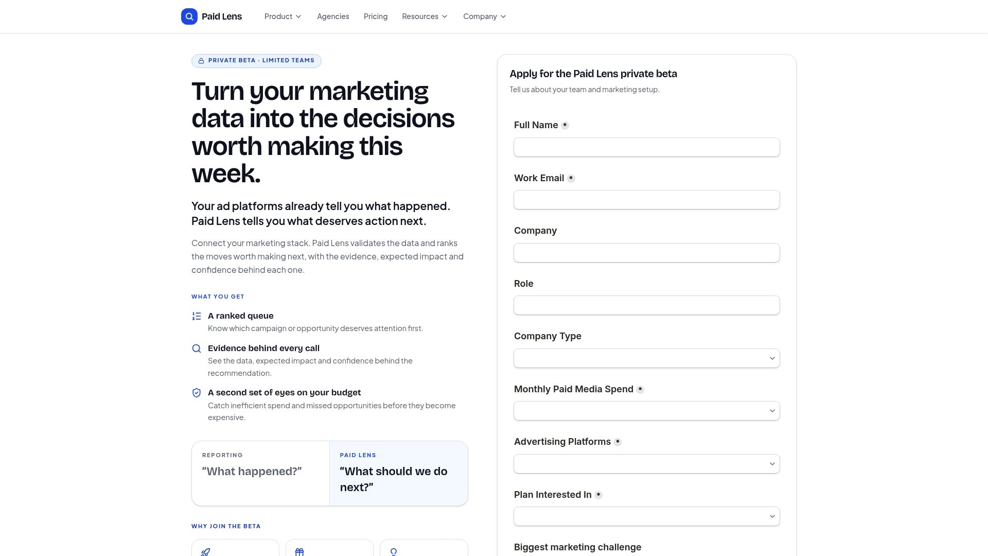
That matters most for performance marketing teams juggling multiple platforms and agencies managing cross-account portfolios, exactly the readers who’ve been nodding through this article’s checklist sections. Paid Lens connects to your ad platforms, GA4, and CRM data in one place, runs the validation your team currently does manually, and surfaces attribution you can actually audit rather than take on faith. If your dashboards are accurate but your team still spends hours deciding what to act on, start a trial and see what the ranked recommendation queue flags first.
Sources
A dashboard is only as trustworthy as the metrics feeding it, and marketing generates more of them than most functions. Building a working marketing data dictionary before you build a single chart prevents half the disputes that come up later.
Core categories worth defining explicitly: acquisition metrics (CPA, CPC, impressions, click-through rate), engagement metrics (session duration, pages per visit, email open rate), conversion metrics (conversion rate, cost per lead, revenue per visitor), and retention metrics (repeat purchase rate, churn, lifetime value). Each category usually pulls from a different data source: ad platforms for spend and impression data, GA4 or an equivalent analytics tool for on-site behavior, and a CRM for anything downstream of the initial conversion, like closed revenue or customer lifetime value.
The trap most teams fall into is defining a metric once inside one platform’s native dashboard and never writing that definition down anywhere else. Then a second analyst builds a parallel dashboard using a slightly different definition of “conversion,” and the two numbers stop matching. A one-page glossary that states exactly how each metric is calculated, and which system owns the source data, solves this before it becomes a credibility problem in a leadership meeting.
Attribution deserves its own line item here. Cross-platform attribution windows rarely line up by default, meaning a lead recorded in your ad platform on day one might show up in your CRM on day three under a different channel label. Deciding on one attribution model and applying it consistently across every dashboard is not optional if you want the numbers to hold up under scrutiny.
- Marketing Data Visualization – Reports and Dashboard For Wise Decision-Making
- D3 by Observable | The JavaScript library for bespoke data visualization
- Chart.js
- Google closes Looker acquisition
FAQ
What is data visualization in marketing?
It’s the practice of turning marketing data (spend, conversions, channel performance) into charts and dashboards so teams can spot trends and make decisions faster than scanning raw spreadsheets.
What are the 3 C’s of data visualization?
Definitions vary across sources, but a commonly cited version emphasizes clarity (a focused, uncluttered visual), context (comparisons and time windows that give numbers meaning), and consistency (the same metric definitions and color logic across every report).
How do I visualize a marketing plan?
Start with the goal each visual needs to answer, then map it to a chart type: use funnel charts for the customer journey, line charts for pacing against targets over time, and KPI cards for the handful of numbers leadership checks first.
What’s the difference between a marketing dashboard and a single report?
A dashboard is a live, recurring view built for ongoing monitoring, while a report is typically a snapshot built for a specific meeting or time period; both should follow the same design and metric-definition rules.
Do I need a developer to build effective marketing dashboards?
Not for most cases. Low-code platforms with pre-built templates cover the majority of marketing reporting needs; you only need a developer’s help with libraries like D3.js when the visual requires custom interactivity that off-the-shelf tools can’t produce.